Over the years I have designed quite a number of complete magazines. Starting out in 1993 as a magazine publisher, I designed my first magazine then. After nearly three decades I’m still proud of it. I wouldn’t do it the same today, but it had all the critical elements including a consistent look throughout, and a visual statement that reflected its purpose.
I love the challenge of designing a complex thing like a magazine: overall concept, colors, fonts, marrying graphic with text, photo presentation, unified layout for different types on content – and keeping the reader in mind at all times.
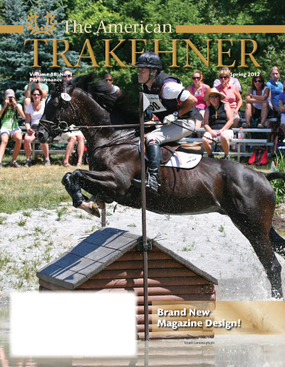
In 2012 I was invited to redesign the American Trakehner Association’s magazine. For the ATA I created a brand-new design for their American Trakehner magazine. The modern Trakehner horse is elegant and successful, with a long history and tradition. My goal with the new design was to reflect that. With a clean page layout, new primary fonts (Stone Sans and Stone Serif), and gold as a core color, the new design honors tradition while bringing a modern look. I produced the magazine for the ATA for several years, and then trained the ATA member who took over the job.


The American Trakehner magazine project resulted in the following comments:
“What a great job you did! I got mine today and sat down and read it cover to cover. The colors were a good choice. It is easy to read and the layout is great. You are to be commended for all of the work that went into launching this new format.”
“The magazine set-up is fabulous! Modern, updated, clean! Super color scheme, graphics! Very, very nice!”